5 Rules of the Ideal Flyer

5 Rules of the Ideal Flyer
There are a lot of rules and principles in flyers and posters creation, let’s learn several of them to make ideal poster to your event.
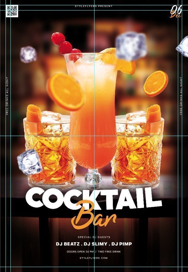
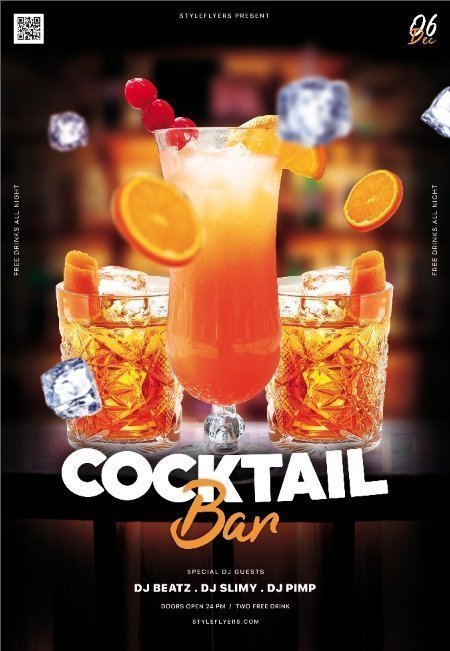
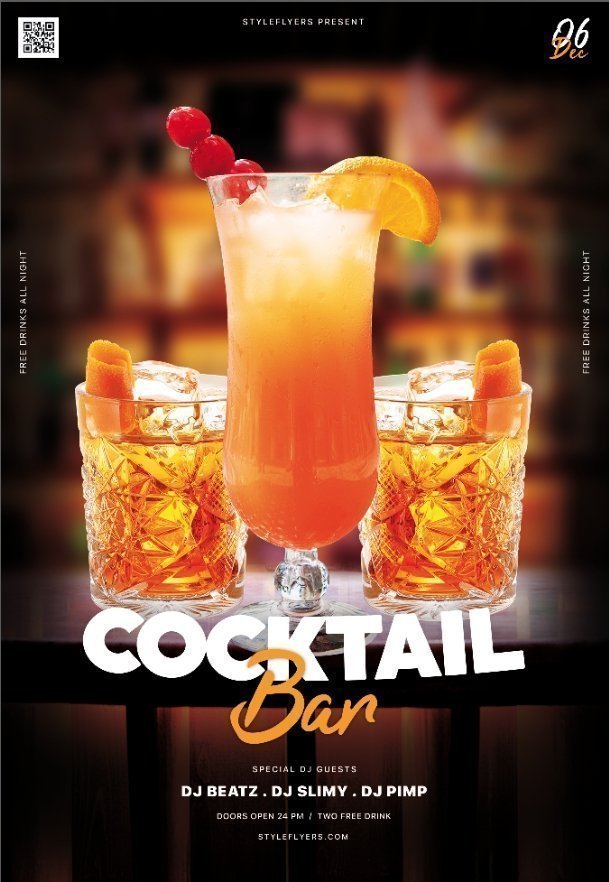
This principles will help you to understand what element is unnecessary and ruins your composition and which one you are missing. For thr example lets take one of the classy flyers – Cocktail Bar PSD Flyer Template – such flyers are one of the most common way to promote your party, place, or event, but how to do it by yourself?
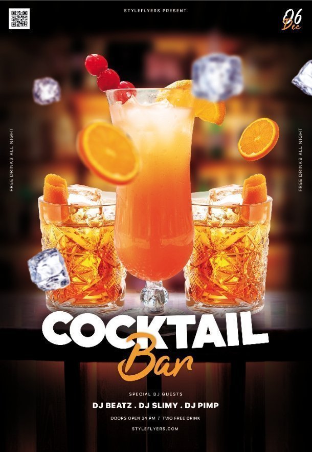
Take a look at the flyer, here are some main parts that we will be speaking about – whole composition, fonts, images, objects, space and background.
1. Whole composition
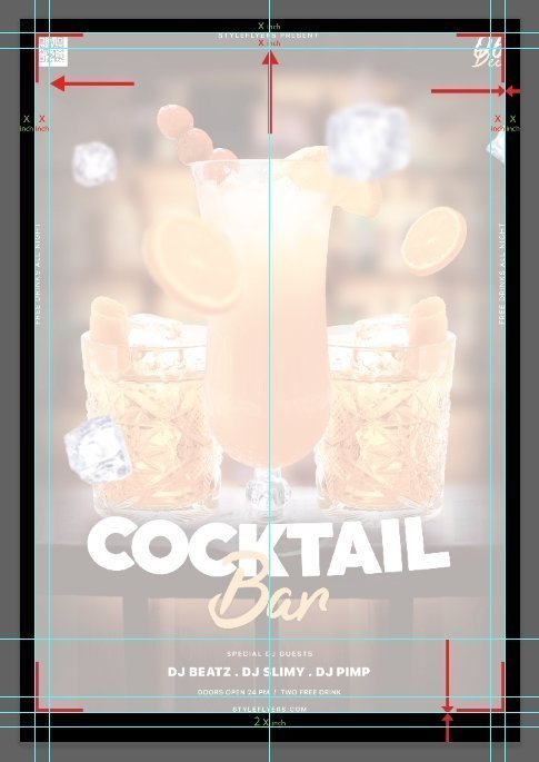
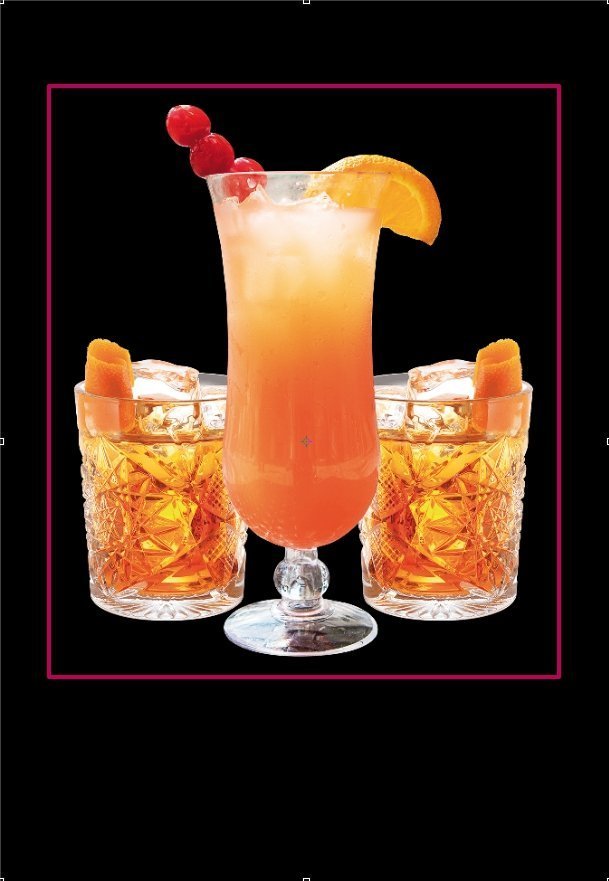
When you start design your flyer you work with its ‘space’ – there are the dimensions you work in – it’s the canvas for your masterpice, and there is a golden rule of the edge space of composition (pay attention to the scheme) – the lower limit is bigger than the upper and side borders, thanks to this we perceive the poster more laconic, otherwise it seems that the bottom is too heavy, so try to leave more space below, and also do not forget the rule of printing – do not put important info near the edge, because it can be damaged during cuting process. Our perception works in such tricky way that full symmetry is not good looking thing.
2. Fonts and Texts.
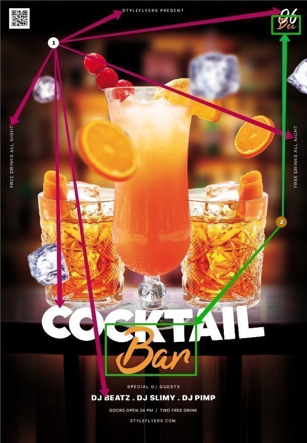
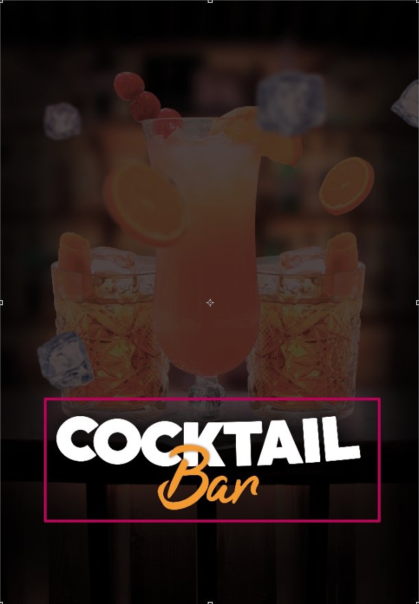
Take a look at the fonts and all text at the flyer. Let’s separate it to header (main text) and text details – other text’s elements. In our symetrical flyer main text take the central position.
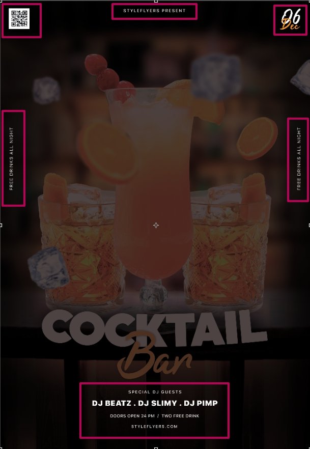
Text details – it all text info – when (date of the event), where (adress and social media adress), who (info about you or your guests) and other details – prices, or conditions.
2.1 Text color
Text color – we used here only 2 colors, as usual it shouldn’t be more than 3 if it’s not part of your creative idea, of course. So check colors of your flyers and select 3 expressive ones
2.2 Fonts
The same situation with fonts at your flyer – here we’ve used 3 fonts. Two of them used in header and as accents (for date) and all other text sined with simple serif font that is easy to read.
Don’t forget that poster must gives you info of the event fast and cleary . When you use more the 3-4 fonts your poster become look messy!
3. Composition
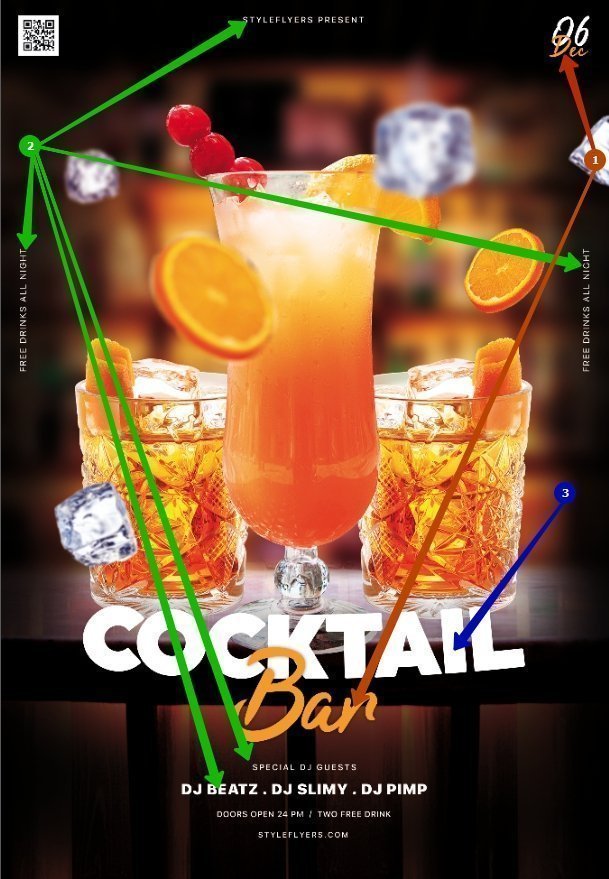
Main composition in this case it’s glasses with cocktails it’s centered and quite simple
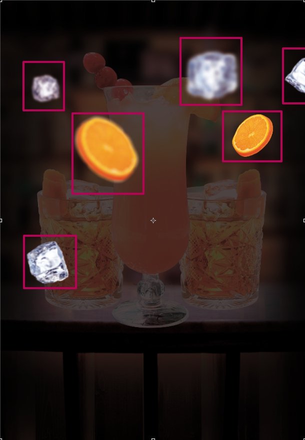
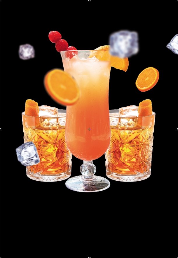
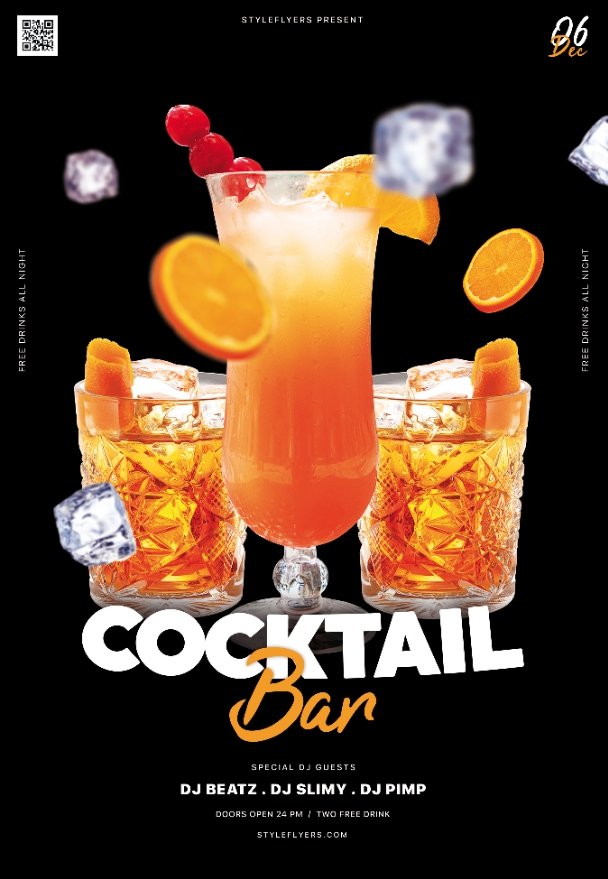
To make it more interesting there were added “flying” fruits and ice cubes this technique gives some dynamics to our flyer.
With this elements whole composition looks more alive you can compare it here, such elements calls ‘flanking’.
4. Balance. Small to big
One of the rules of composition is balance of the forms at your masterpiece there always have to be some big form or idea (it can be human, main element, main text, etc) that gather smaller forms around itself
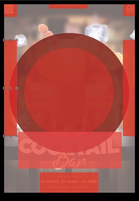
5. Space and back
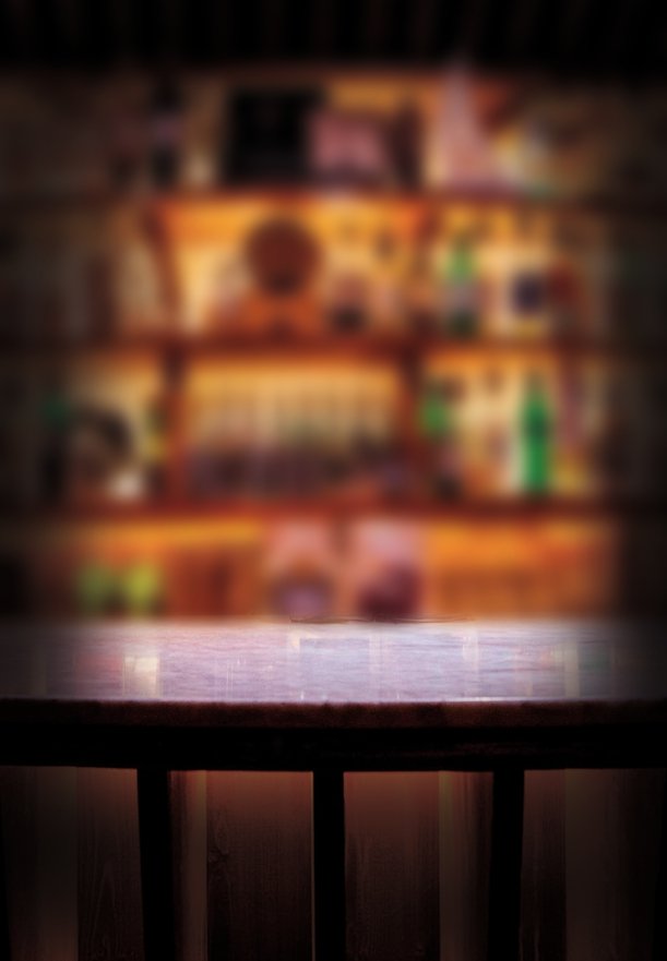
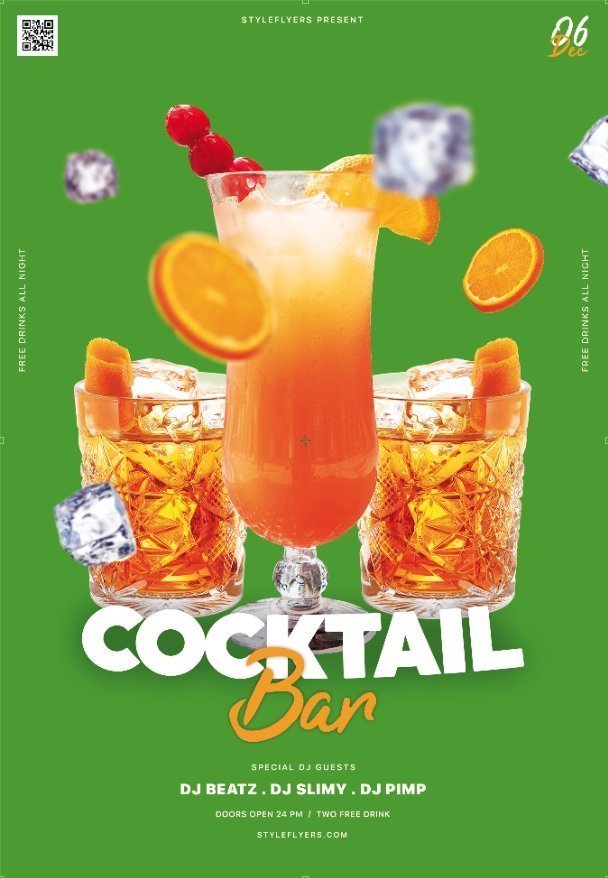
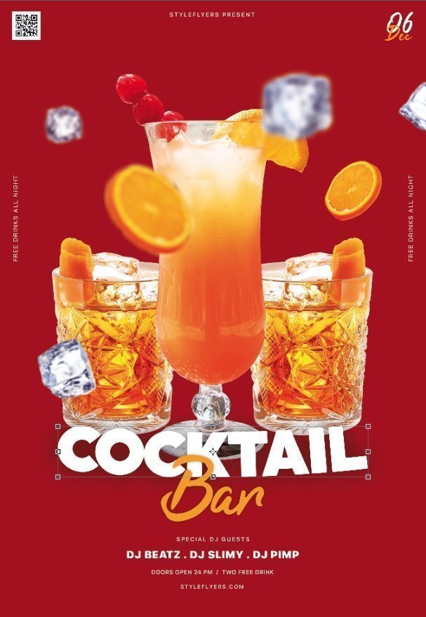
In well done poster your background is also a player -and it’s name is mood!!! As you can see we can separate the back from the main elements and it will still works but the ‘mood’ will be totaly different. Back gives you surround – and it’s the biggest object at your poster, but not the main one. It’s highly important to give enough space to all main object in your poster, without it the composition will fall apart, so don’t think that there is nothing info – your free space is very important part of the design, there even are flyers with free space as the main idea – such composition called – ‘paused’ – write if you want us to tell more about it.
Write us about your favorite flyer compositions, or what kind of compositions you want to know more, and we will make a research about it.


has been added to your cart


